Dark Portrait in desaturated 3
Mark Keefer

Dark Portrait in desaturated 3

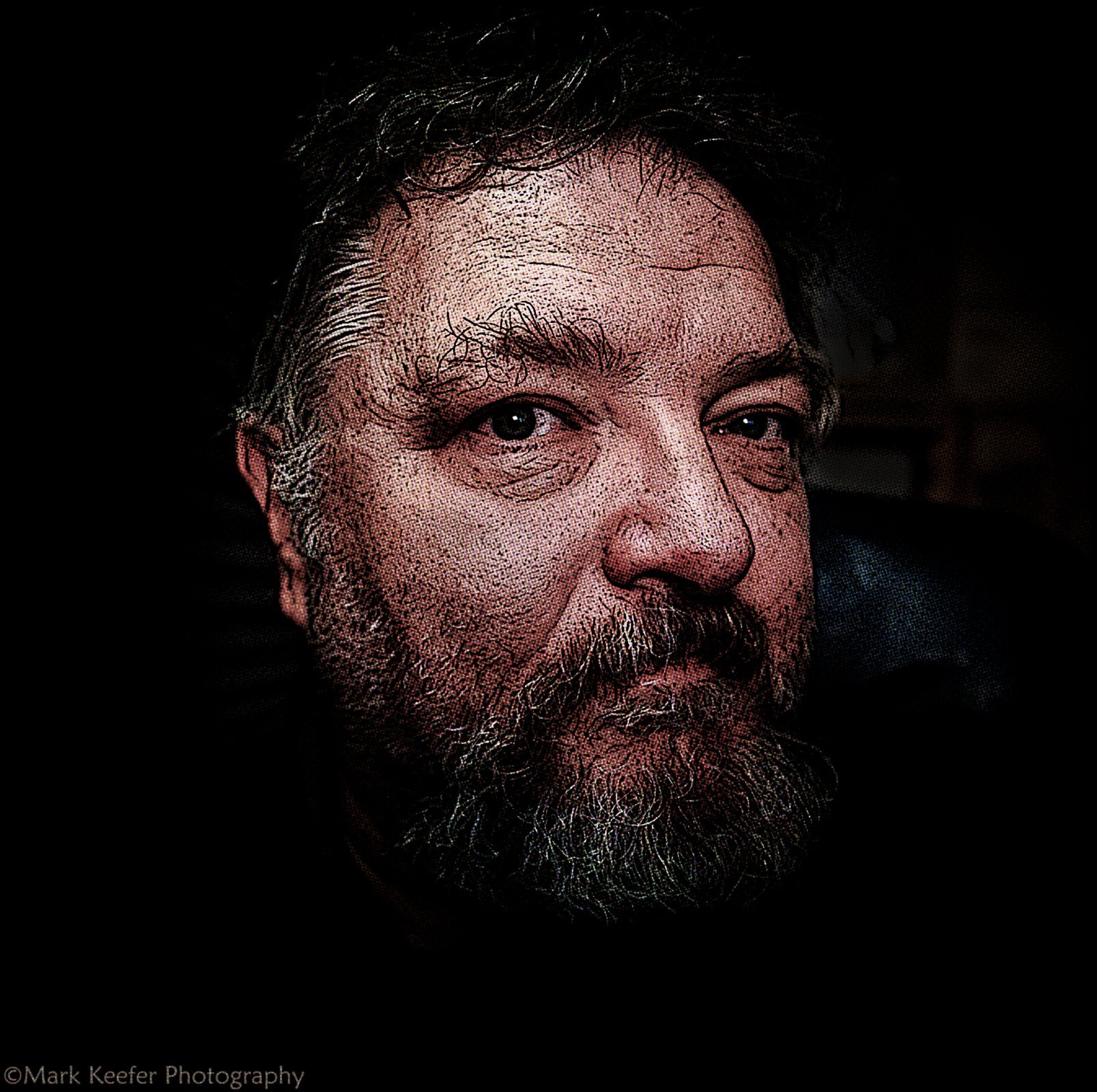
Micky, I worked on several B&W versions and was no happy with the results. I went with a desaturated version. The previous version was heavy saturation going for a dramatic comic book look. Here is a desaturated version to the point where it doesn't lose depth.
  • + 2 !
Reactions: Papa Tango
Hi Mark,
Some shots are great for color, some for black and white, and a few shots can go either way. Ultimately it is the person behind the camera that makes that artistic decision.
That said, the color version is fantastic, and the desaturated one ain't bad at all.
Have a great day my friend!
Mick
 
Micky, I think I could do a B&W version from the original but will have to use a different editing approach.
 
Hi Mark,
I'd love to the black and white if you get the time to try that alternate editing /approach.
Mick
 
Hi Mark,
I'd love to the black and white if you get the time to try that alternate editing /approach.
Mick
I did this, but edited it just as a B&W photo, no art effect. Pretty much just a Lightroom - Photoshop tweak. No need for layering. The lighting used was a DIY 12 VDC Soft LED I rigged up in a soft box that can just plug off any 12 VDC battery. It does the job.
DarkPortraitinBW48783-2.jpg.a45c6c793ba5745eb3b6c4e33a8fe7a8.jpg
 
Last edited:
Hi Mark,
I'd love to the black and white if you get the time to try that alternate editing /approach.
Mick
Opps, I messed up, that isn't the same image, that was the next shot. Here is that same shot and angle. I put this in my personal portfolio so I am not filling the home page here with the same image with different visions. Don't want to wear out my welcome before I get the boot. lol. Apologies Pappa Tango. https://fotofora.net/media/dark-portrait-in-bw-48782-2-3-jpg.857/
 
Mark,

The first one strikes me as the best. It has so much character and leaps from the screen.
Sorry for filling the site with the same image. I put the third in a personal folder and set it viewable for only members, but It is showing up on the home page and I see three versions. Should I delete one? Sorry, I don't want to monopolize the site. And I put it in a reply to Micky. Guess becasue it is in an open thread. 😟
 
Opps, I messed up, that isn't the same image, that was the next shot. Here is that same shot and angle. I put this in my personal portfolio so I am not filling the home page here with the same image with different visions. Don't want to wear out my welcome before I get the boot. lol. Apologies Pappa Tango. https://fotofora.net/media/dark-portrait-in-bw-48782-2-3-jpg.857/
Hi Mark,
My comments on the other shot apply here as well:
"More drama, intrigue, character. Great tones, areas where light and shadow dance with each other. I do like this much better than the color version." "Both shots are superb IMHO."
Mick
 
Hi Mark,
My comments on the other shot apply here as well:
"More drama, intrigue, character. Great tones, areas where light and shadow dance with each other. I do like this much better than the color version." "Both shots are superb IMHO."
Mick
Thanks, Mick.
 

Media information

Category
Studio Creations
Added by
Mark Keefer
Date added
View count
857
Comment count
10
Rating
0.00 star(s) 0 ratings

Image metadata

Filename
Dark Portrait indesaturated 3-.jpg
File size
3 MB
Date taken
Wed, 05 July 2023 1:28 AM
Dimensions
2000px x 1992px
Top Bottom